
Brand design trends 2026: how to stay current without looking the same
The 2026 brand design trends worth using and how challenger brands can stay current without looking like everyone else.
Brand design trends 2026: how to stay current without looking the same
We wrote about design trends in 2023. Some of that article aged better than expected. Experimental typography kept developing. Handmade visual language became more relevant, not less. AI went from an interesting final section to part of the machinery behind the work.
Other predictions stopped being useful. “3D design” is no longer much of a trend. It is a production capability.
What has become clearer in 2026 is that the important shifts are less about individual visual effects and more about how identities are built and used.
The brand design trends worth paying attention to in 2026 are expressive typography, visible authorship, richer visual worlds and flexible identity systems. The goal is not to copy the look of the year. It is to turn a relevant shift into something people can recognise as yours.
Typography is doing more of the branding
Three years ago, we called this experimental typography. The shift now goes further.
Type is increasingly being asked to carry identity rather than simply support it. Custom families, variable fonts and more expressive systems are being designed to work across campaigns, interfaces, motion, packaging and everyday communications.
Koto made the point unusually explicit when it launched CcType in July 2026. The studio said it had repeatedly encountered typefaces that worked well in one application but struggled once a brand needed them to perform across websites, apps, campaigns, motion and billboards. Its first release was designed around being able to change character while keeping the system cohesive. Koto: CcType launch
The opportunity is not a typeface that looks distinctive once. It is a typographic system people can recognise across the brand.
A useful test is to remove the logo. If the typography, hierarchy and composition still feel recognisable, type is contributing to the identity. If everything becomes anonymous without the mark in the corner, it probably is not doing as much work as the brand team thinks.
We faced that question with Dolly’s. The branding problem was not simply to make an açai business look colourful. Dolly’s needed to communicate quality without becoming precious, retain the warmth of the founders and community around it, and have enough structure to grow.
We built a geometric wordmark with a curled “S” inspired by Dolly the pug’s tail, paired expressive Realce headlines with the quieter Roboto for body copy, and developed a wider system of colour, illustration and tone of voice. It then had to hold together across menus, cups, merchandise and ongoing content rather than only looking good in the identity presentation.
That balance is what makes expressive typography commercially useful. Dolly’s has somewhere to show personality and somewhere to communicate clearly. As unusual display faces become more common, choosing one is not enough; repeated typographic behaviour is what has a chance of becoming associated with the brand.
AI is making provenance more valuable
One of the more convincing 2026 shifts is happening alongside AI rather than inside it.
Canva analysed behaviour across its creator community and found searches for DIY and scrapbook-style elements up 90% year on year. Its wider 2026 forecast includes tactile textures, lo-fi work and deliberately unfinished visual language. Canva: 2026 Design Trends Adobe’s 2026 research separately points to sensory work and imagery grounded in particular places and cultures. Adobe: 2026 Creative Trends Forecast
It is tempting to call all of this a search for “authenticity”, but the production change underneath it is more useful.
Competent polish is becoming cheaper. A plausible image, product render or new creative direction can be made far faster than it could a few years ago. When the ability to produce more options becomes widely available, the source of the idea and the judgement applied to it start to matter more.
That source could be a founder’s handwriting, an archive, a particular material, a photographic convention, an illustrator’s hand or something specific to the place and people behind the business.
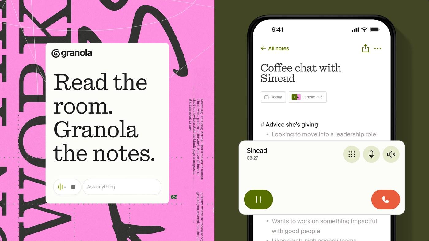
Ragged Edge took exactly that route with its 2026 identity for AI notepad Granola. Rather than borrowing the familiar polished language of SaaS, the studio created an evolving script from co-founder Sam Stephenson’s handwriting and built a hand-drawn quality into the identity. Ragged Edge: Granola case study
The point is not that handwritten work is inherently better than generated work. Handwriting itself can become another copied aesthetic. What matters is that Granola had something specific from which to build.
This is also why AI does not make art direction less important. It makes weak art direction easier to expose.
Generating fifty directions is increasingly easy. Deciding which five actually belong to the brand is the harder job.
The interesting part of maximalism is commitment
There is no shortage of colour, characters, collage, oversized type and dense composition in 2026. “Maximalism” describes some of what it looks like, but it does not explain why the stronger identities work.
They tend to commit further to a central idea.
JKR’s current work for KFC is a useful large-scale example. Instead of inventing a collection of unrelated new visual devices, the agency pushed an asset KFC already owns—the bucket—much further. The resulting “Bucketverse” uses it as the basis of a wider world and experience rather than treating it simply as packaging or a logo container. JKR: KFC — Welcome to the Bucketverse
For an established brand, that means extracting more value from something people already know. For a challenger, the job is earlier: deciding which assets are worth building in the first place.
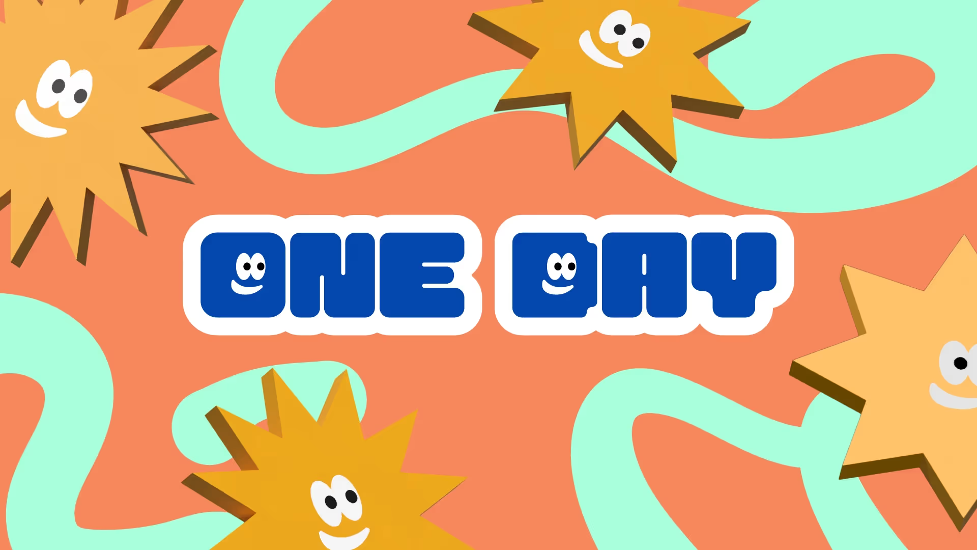
That was the challenge with One Day Workshops, whose Social Fixation case study sits under One Day Branding.
The business was entering a leadership-training category full of familiar corporate cues. It needed to appeal to HR teams without making the product feel like another institutional training program for the first-time managers attending it.
Rather than simply making the category brighter, we built the identity around the experience of progression. The system uses a sunny mascot, progress bars, achievement badges and game-inspired graphics, tied together by a tone designed to make leadership feel participatory rather than bureaucratic.
Those elements give the brand several things it can repeatedly use without needing a new visual conceit for every piece of communication.
That is the part of the current “maximalist” movement worth paying attention to. More visual material can create a richer and more recognisable world when the pieces come from the same idea. More material without that logic simply creates more assets to manage.
A brand identity now has to behave, not just look right
This is probably the least fashionable shift here and the one most likely to matter in five years.
A modern identity gets handed to social teams, developers, media agencies, retailers, photographers, videographers, internal marketers and production partners. It appears vertically, horizontally, animated, tiny, enormous, printed and interactive.
Traditional guidelines were very good at specifying logo clearance. They were less likely to tell a team how the brand should move, how layouts should adapt or which parts of the identity are allowed to change.
BritBox’s 2026 refresh shows the distinction well. Sibling Rivalry took the small box already present in the brand and turned it into a wider device for framing characters, UI elements and content. The project covers visual identity, animation, sonic identity and a content system, with the box acting as a consistent component across them. Sibling Rivalry: BritBox case study
This is where motion and 3D become more useful to discuss. They are not especially meaningful trends by themselves. What matters is whether a brand develops a recognisable way to move, occupy space or change between contexts.
The hard part is deciding what should remain fixed.
Ehrenberg-Bass research on distinctive assets is relevant here because it treats assets such as colours, fonts, logos, characters and sounds as valuable when they become both unique to a brand and sufficiently well known to evoke it. That process depends on repeated, consistent use; constantly refreshing the identity can work against the associations a brand is trying to build. Ehrenberg-Bass: Brands of Distinction
A good flexible system therefore does not make everything flexible. It protects a small number of things people should learn to recognise and creates room around them for the brand to keep moving.
The brand should be able to produce something new without looking newly branded every week.
What is worth keeping from 2026?
Probably less than most trend reports suggest.
Expressive typography is worth using when its behaviour can become recognisable. Handmade, local or culturally specific visual language is stronger when it comes from a real source rather than a texture pack. Richer brand worlds work when their parts reinforce the same idea. Motion, dimensionality and flexibility matter when they help an identity survive the places it actually has to operate.
Trends can expand what moves. Brand building depends on protecting what people should remember.
If the identity only works in the launch deck, it is not doing enough. Our branding work gives challenger brands a sharper point of view and a system built to carry it into the real world.

