Dolly's
Dolly’s isn’t just about acai bowls. It’s about community, creativity, and a little pug with a curly tail. What started as a neighbourhood favourite quickly became a local ritual, loved for its premium ingredients, playful attitude, and heartfelt story. Every bowl is packed with quality, colour, and care. And behind it all? Dolly the pug, inspiring a brand that’s as warm and joyful as she is.
The Brief
Dolly’s needed a brand identity that celebrated both quality and community. The goal was to create a visual and verbal system that felt premium yet not pretentious, one that could scale with growth while still maintaining a personal and charming feel. Every element had to capture the warmth of the founders, the loyalty of their customers, and the cheeky spirit of Dolly herself.
The Work
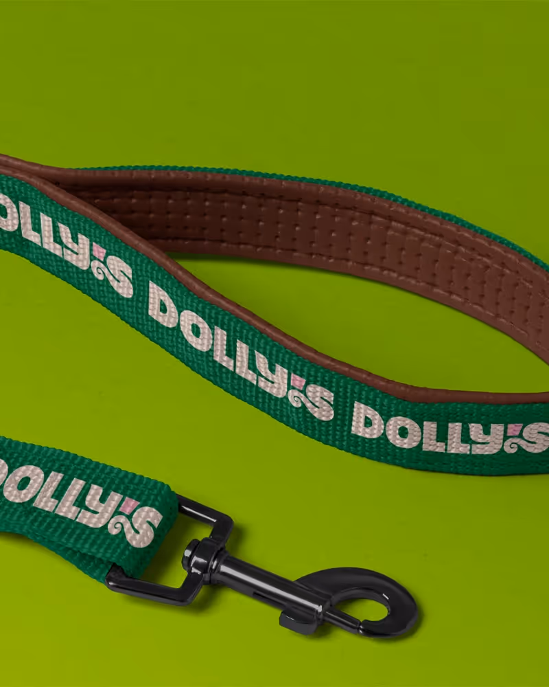
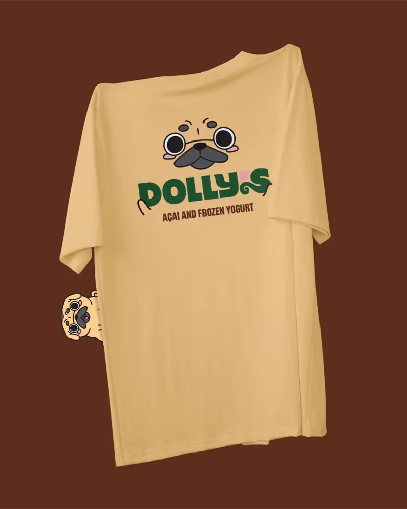
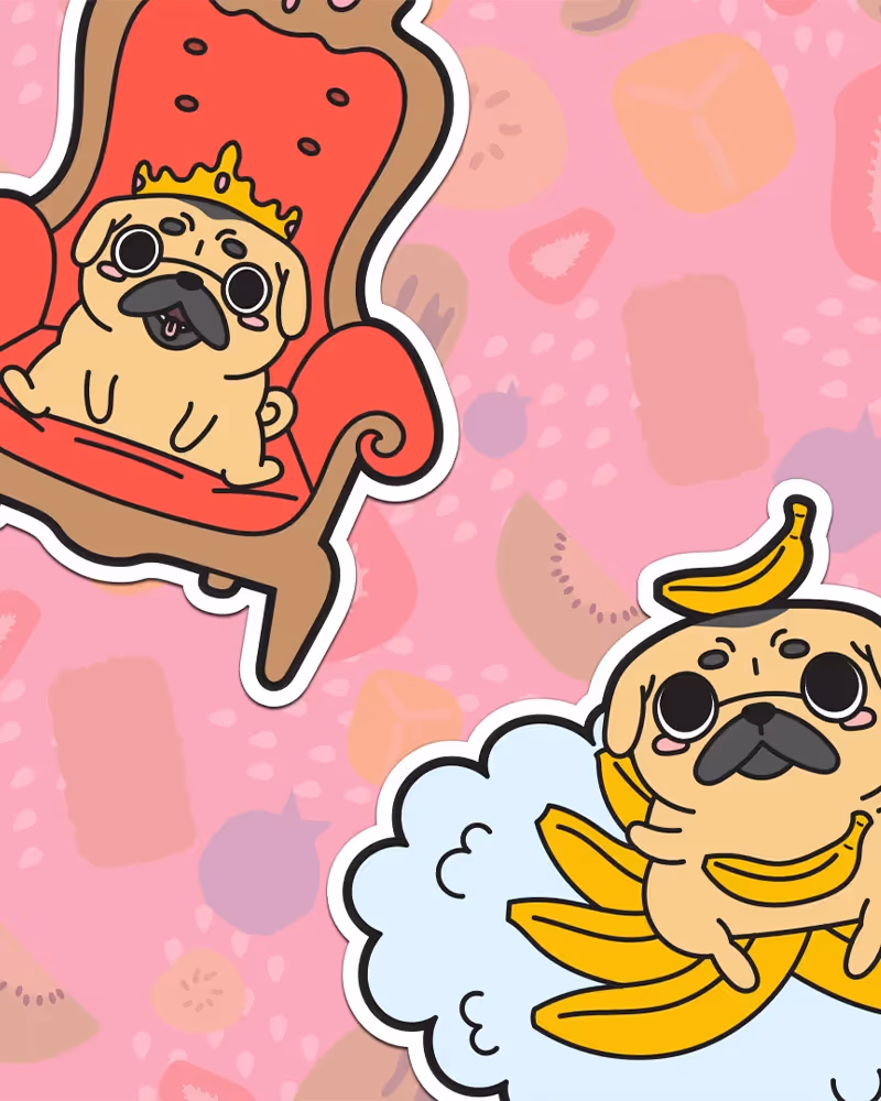
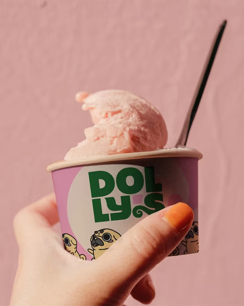
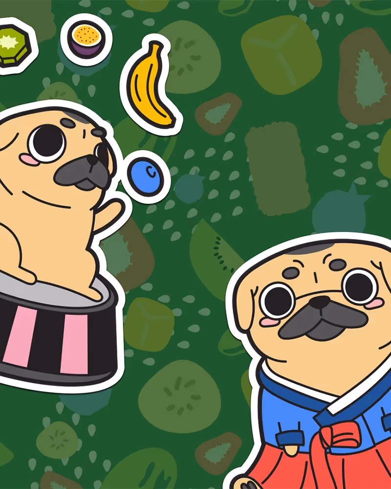
We built a brand that feels like your favourite corner shop, just with better design. The logo features strong, geometric type with a curled “S” inspired by Dolly’s wagging tail. The colour palette is fresh and inviting, combining earthy greens and browns with the warmth of Almond and the punch of Sundown pink. Illustrations of Dolly herself, surfing, lounging, or banana-balanced, bring each flavour to life with personality and joy.
Typography combines Realce for expressive, high-impact headlines with Roboto for clarity and warmth in body copy. The tone of voice is friendly and upbeat, always grounded in the brand’s three pillars: quality excellence, authenticity and joy, and community connection. It’s premium without the ego. Fun without the fluff.
From menus to merch, cups to content, every detail was designed to make people smile, and keep them coming back.