Tub O' Dough
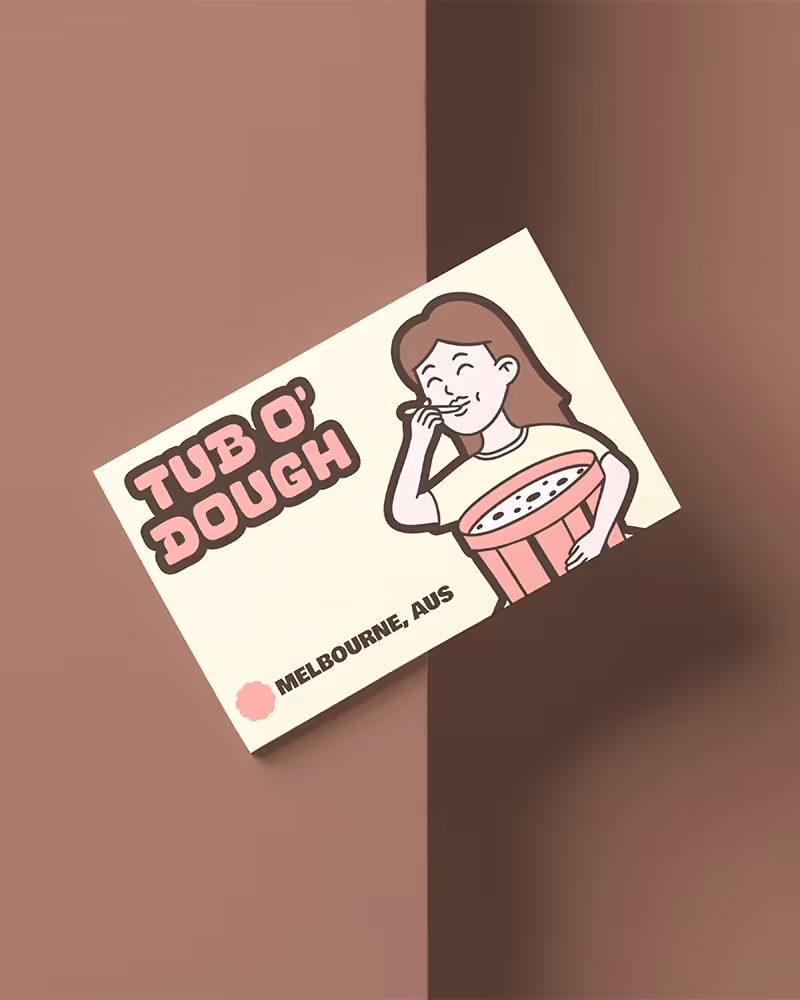
Tub O’ Dough was never meant to fit in. Created as a bold, character-led cookie dough brand, it was built to challenge the clean, neutral aesthetic dominating health-conscious snacks. Instead, it embraces maximalism, nostalgia, and unapologetic indulgence—designed for a new generation of treat-lovers who want flavour, fun, and something worth sharing.

The Brief
The challenge was to create a brand that would instantly stand out in a sea of beige. Tub O’ Dough needed a full visual and verbal identity that celebrated indulgence without apology. The goal was to build a world that felt nostalgic, cheeky, and full of character, while staying commercially viable and cohesive across packaging, digital, and retail.
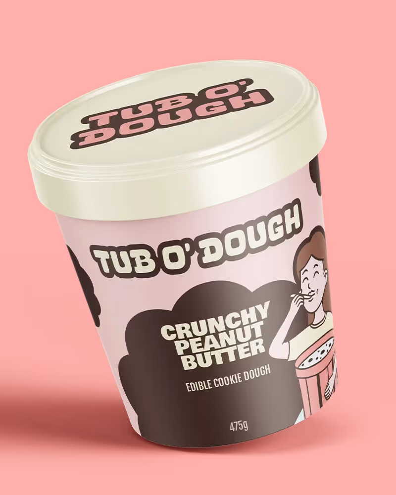
The Work
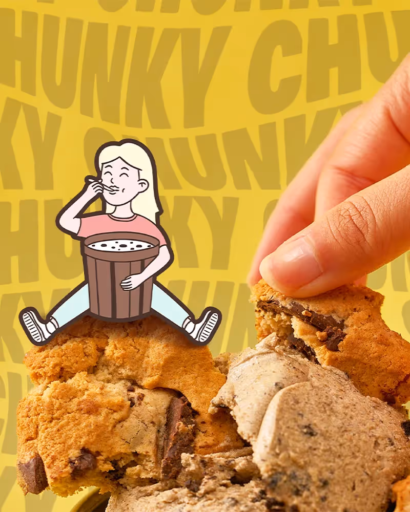
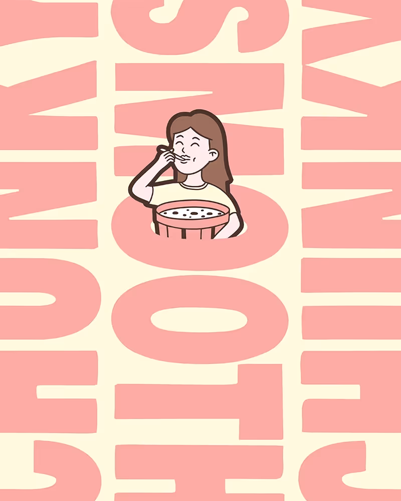
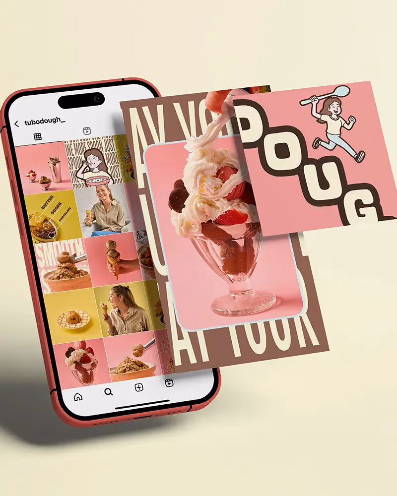
We built an expressive, character-first brand from the inside out. At its centre is a custom-illustrated girl—mischievous, sweet, and instantly iconic. She leads the brand across tubs, stickers, socials, and merch. The retro-inspired wordmark, warm pastel palette, and layered layout system create energy and movement at every touchpoint. The tone of voice is playful and punchy, always bringing personality to the forefront.
The result is a brand that’s nostalgic but not naive. Sweet but never soft. Designed to feel like a treat the moment you see it. Since launch, Tub O’ Dough has built strong community engagement and fast retail momentum, powered by a visual identity that’s as bold as the product itself.